I like number 2. The dark clouds make the cathedral more domineering, even a little scary, and that adds character to what normally would like a normal tourist destination type photo.
I think you can play with #2 to get the clear and sharp building while maintaining (and improving) the clouds. I think this would be the optimum solution.
the clouds in the second add to the picture … as what ahmed said.. sharpen the building without adding highlights to it… adjust the contrast … and add your touches to the sky ! Too much light would make the picutre looks unreal !
#1 has much higher contrast but not true colors, look at the top of the building behind the church which i’m not sure what those are but they are faded out in #1.
You can add lighting and shadowing to images using applications or plugins, or you can also mix the 2 images together by blending or tone mapping for a better result. So my final answer would be #2.
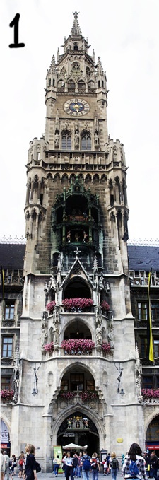
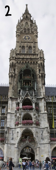
Thank you guys for your input, I appreciate it. The picture was taken in Munich in July. I photoshopped image #1 and #2 is how it looked originally. Personally I think #1 looks better, But I understand that the sky was totally lost in the process. I need to get better in photoshop.


I like number 2. The dark clouds make the cathedral more domineering, even a little scary, and that adds character to what normally would like a normal tourist destination type photo.
left one sharper details
2 the upper part
1 the half down
can’t join them ? 🙂
2nd, that is in bruges?
number 1. It’s got more detail and tends to work better overall IMHO
number 1 if you show the clouds
#1 better detailes and crisper
I think you can play with #2 to get the clear and sharp building while maintaining (and improving) the clouds. I think this would be the optimum solution.
I prefer #1
It’s easier on the eyes
the clouds in the second add to the picture … as what ahmed said.. sharpen the building without adding highlights to it… adjust the contrast … and add your touches to the sky ! Too much light would make the picutre looks unreal !
Number 1 because it looks like it was taken in Disneyland 🙂 Was this taken in Prague?
number one has great details but its over exposed , number 2 is good but kind of dull and a little under exposed
#2 because of the clouds…and i’m guessing it’s something historic so darker details on the building is preferable.
#1 looks more surreal and isn’t washed out.
#1 has much higher contrast but not true colors, look at the top of the building behind the church which i’m not sure what those are but they are faded out in #1.
You can add lighting and shadowing to images using applications or plugins, or you can also mix the 2 images together by blending or tone mapping for a better result. So my final answer would be #2.
number 2 🙂 looks unedited and more natural… I see the details of bricks clearer in #2
no 1 .. more alive and colorful the other one seems dull.
although the contrast makes the upper and lower parts not matching with each other in no 1 ..
i guess no 2 is much natural than no1.
i prefer number 1 men ta7at .. w number 2 men foog ..
Number one if you photoshop the white background with a blue sky with some clouds.
الاولى عجبتني اكثر .. في حياة أكثر من الثانيه
Thank you guys for your input, I appreciate it. The picture was taken in Munich in July. I photoshopped image #1 and #2 is how it looked originally. Personally I think #1 looks better, But I understand that the sky was totally lost in the process. I need to get better in photoshop.
Thank you all again. 🙂
1
Because its brighter and the flowers appear to look sharper.
more of a happy picture I would say.