

We’re thrilled today to share the new revamped SOMEContrast site with all of you dear readers. We’ve been working with a talented group of people from a local design company, Circus Branding Circle, and we’re very proud to finally share the results.
We’re also excited to get your feedback and reactions to the logo, the layout, the colors and basically the whole look. So! Do tell! What do you think?
MABROOOOOOOOOOOOOOK guys… i like the colors mashalla.. 3ajeeb 😉
Congratulations…..
But i really do have a suggestion. The Top Banner is way too big, it occupies a lot of space….The color….well its a matter of personal choice…!!If the main color was black with the purple lines….it wud have been even better!!!
Mabrooook wayed 7elo 🙂 allah ewafgkOm ya rab 🙂
It looks great…..
it looks really gd…especially the logo..just my opinion but maybe it should be a little bigger in the header? it really is a very nice logo..
LO
LO
LO
VE
ittttt
3al barakkah!!!
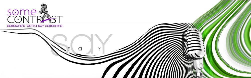
WOW WOW WOW! Mashalla IYANIN! The design company thought of the zebra’s behind concept? Well whoever thought of that lots of kudos to him/her because I just love it! I like that it’s a zebra because of your blog title being about contrast and I love that it’s giving us its behind because it’s quirky and humorous. That’s my favorite thing actually about the whole change. A7is it’s just the kind of fun, teasing, playful kind of logo that suits this blog. OO 6ab3an il alwaan as much as it seems like it ought to be busy-looking it’s actually not! Who ever thought that black, white, purple and green would make for a catchy combo! Ba3dain I like how in the head banner the black/white is fading into the green near the microphone so imbayyin chinna 9ada 9ot! La2 9ijj guys mashalla mashalla bravo 3ala whatever “talented group of people” who worked on this li2anhum fi3lan bada3aww mashalla 🙂
MY EYES MY EYEES !!
How much did you pay for this eye sore
Sorry, one more thing, I read Eddy’s comment and I couldn’t agree more because the logo really is total worth making it bigger. Qasdi yiswa inaa yseer more central. Ya3ni lo bidaal ” Say” tsawoon il logo ath5am and more central tarawali a7la. Bass ham 7ilo as is.
Congrats on your new look! I can feel the “contrast”
ماشالله حلو واتعب على الزيبرا :p
بس عندي ملاحظه
مكان الكومنتات صاير مايل شوي صوب اليمين لو تخلونه بالنص يكون افضل
عشان عيونا ماتنحرف صوب اليمين 🙂
I love the colours and I also agree on the Logo that it should be bigger.. but the Logo is really amazing!!
Love the colors! the purple, black and green go well together 🙂
I do, however, agree with ‘My name is bond’ with the banner being too big. As readers, we have to scroll down a ways just to see the first post. Also, don’t know if this was intentionally done or not, but archives is spelt ‘archides’
anyways good job to you guys and the designers!
Sorry but I don’t like the new design…
The colors hurt my eyes, and the banner with the mic is ugly.
However, the logo is brilliant except for the zeebra’s ass which might be a little bit funny but inappropriate 😉
Anyway, that’s just my opnion.
BTW, you could dipose the banner with the mic and replace it with the zeebra’s banner (by enlargig it of course). For the colors, you could decrease the color intesity so that it becomes more “eye friendly” 🙂
Note: Why do you have two buttons for sending emails? (contact us & email us)
I just noticed this, but I like how each user has his/her own random logo which does not change when posting a new post (I’m talking about the small sqaure logo on the right of the post)
shino hel thyog mashallah 3ajeb waied 3ajebny style , machallah waied 7ilo
Mabroook!! I loved the logo!! Very nice:)
“Our Reviews” is misspelled as “Our Views”!!
Good effort!!
But if you consider the suggestions from the end users!! You could make it more EYE CANDY
Congratulations good work ! mashalah
@SooLong!!
That Square Logos are a Word Press feature…
looks pretty good guys.. congrats!
manii mistaw3iba inna this is ur site;p ta3awadna 3ala ur other template..
but I have to admit, this is nice! very creative! wish u all the best!
marvelous, awesome, i totally agree on this move … two thumbs up 😉
keep it up on that pace 😉
Excellent Work Team !
I love the details, love how the ad section had different layouts.
Aside from that, look on the top left, where it says email us, its a bit out of line. Thats my only concern.
That being said, Mashalla the “contrast” is just mighty fine.
More power to you !
loved it!!!!
its so unique.
I agree with Eddy and my name is bond.
Personally, i dont like purple/green..but the colors looked okay together..the zebra with the O is brilliant!
anyway, dnt loose the mic, i loved it! just place it somewhere else.. OR you could shuffle the logo and the mic at the top of the page?
You really have to work on it, i use a netbook, so imagine how it wuld feel like when i first open your blog -.-..scroll all the away :/
Check your disclaImer
Guys congrats!
I have been following your blog for a long time and it was about time for change. Well done. I particularly like the new logo 😉 and agree with “My name is Bond” that the top banner is way too wide…
Otherwise… good work and good graphics team!
Alf Mabrook Yousef o Meshary. The re-branding is just second to none.. Total change in concept and approach. I really like it o minha lel a3la inshalah.
Again, alf mabrook.
bilimbark!
Great!!! heartwork!
Congrats! It looks great! I like the new colors!
awesome , i love the zebra and i love Microphon om kalthoum 🙂
Hello All,
u jst have not seen anything from CIRCUS yet.. more of the magician arts is coming up.. enjoyyyyyyyyyyyyyy…
Mabrook .. I agree with couple of readers .. the header is bit big + the header part don’t seem to blend well with the rest of the page .. it feels detached .. on the other hand, the logo is looks really good .. Congrats! 😉
OMFG!! Drop that Rotana Music banner ASAP! 🙁
woooooooow mabrooook
wayd 7elooo 😉
Nice design work but heres my feedback
1. the banner is too big
2. violet side bars don’t really gel with the other elements(unless you wanted ‘some contrast 😛 )
3. ‘someone’s gotta say something’ is awkward with the upper case and lower case characters mixed up
4. please add a comment subscription option to your blog or atleast an alert when a new comment is posted.
5. ‘our recipes’ button is missing at the bottom
6. the ‘d’ in advertise and ‘v’ in archives look like the same letter
Mashalah Mishary
keep going
I LuVv iTTT !!
waaayid 7elo! i love the zebras;p
I think the purple is too bright a color, if it can be taken down a notch or two..
I really like the new lay out..
The Zebra is AWESOME! love the pose! hahaha
Overall great job!
Ya36ekum el 3afyaa
bs el blog roul & calendar , e5tefaw @@
If you examine the very bottom….there is one white line…! which can be removed to give a complete feel to it….
WoooooooooW MabrooooK 🙂
Mabroookeeeen 3al neew LOOK ;)))) wayeeed 7ilo mashaallaa :)) especially al LOGO ow al SLOGAN :))
Congratulations guys 🙂
Nice work!!
LOL twne ala7e’6 ur names 3al microphne 😛
WOOOWW !!!!! thats amazing !
and i second marzoug with the purple color its a bit to bright
totally loved the zibra !
Good effort but I don’t like the header at all. One word to describe the whole thing – it’s “too much”. I feel it’s “5ab9a” wayid. The colors are trying so hard to fit in with each other and the design where it says “say” and microphone looks wrong for some reason. Ironically I absolutely love the Zebra logo.
If you take a look at your last post with the logo picture – regarding the announcement for the new design. The logo by itself without the green or Zain-replica spirals looks beautiful with a plain white background. It’s simple, creative and funky.
If you’re interested in hearing a suggestion then I’d skip the header all together and just go with the zebra logo with a simple colored background, and go for simple icons/buttons without all the 3afsa. And just like some ppl here said, mabye darken the purple just a teeny bit.
mabrook the blog looks amazing and the colors wow
i just miss the blogroll/ blog links on the right i dont know where did they go
congrats
beautiful design
Honestly, I think it looks horrendous.
Clearly, I think u look not honest and jealous.
I LOOOOVEE IT !!
7ada 3ajeeb, the colors w everything looks great !
I agree with Mark. It’s very ugly;\ The microphone is misleading, too.
And Miss-Informed makes a good point. If you use just the logo on the top left corner with a plain purple background would look great. This is too much.
My fave: the zebra concept!
nice nnice nice
very nice 🙂
I know you guys are very excited about this, and I don’t wanna spoil the moment but I have to say that the only thing I like about the new layout is the LOGO .. very creative and meaningful.
The colors remind me of Zain!
and the mic banner (Rotana banner) is very distracting..
I also don’t like how everything is shifted to the right instead of the left !
I still love your blog and will continue reading it even if I have to stare at that banner everyday 🙂
Hallaaa yal 3oood
mabrokeen nshalaaah 3ala el new look
zebra’s ass?
wayeed 7eloow mashalaa !! love the purple ;p
Mabrok ..
but I got to say that the older style was WAY better.
Hello Mishary
well done , good job
Mashalah alikom shabab good work
o ur one of the best bloger bl net
Yousef & Mishary, been reading you guys almost ever since you started and i can’t but say that this place has been changing on a regular basis in terms of material or “mood” .. congrats on the new theme !
i totally agree with Amethyst,honestly the layout is to much! i love the zebra but hate the rest,anyway mabruk 🙂
From a creative aspect it looks creative and beautiful but from a design aspect is has some missing issues, for one thing the sidebar is in the wrong location. What you have here is an English blog, one mostly written in English to have the sidebar on the Left depicts that it would be great for writing arabic posts, to have it on the right would’ve made more sense.
Remember our right hands are on our mice and we are lazy to go to the left side in order to navigate around the site.
The purple around the edges are eating in from the content area’s space it would’ve been better served if it was around the header and into the Black Background area as to not affect much bcos it’s just aesthetic and not something that’ll mean much or serve a functionality.
It just seems too busy for a blog, for a normal website it might be perfectly fine, but a blog it’s just too busy and takes away from blog’s simplicity to display information portrayed by its writers.
Just my 2 cents.
Congratulations!
I loved the Zebra design and what it represented. The color theme is also a nice addition but I think you should reconsider placing the blogroll back on the right side.
There also seems to be a mistake with the number of comments in this post.
Clean – Fresh – Summer – zebra .. Loves it 🙂 Good Luck
Oops… I didn’t see the ‘older comments’ link in the bottom.
Keep it up!
la elaha ela allaah
9ij shy unique
unique idea
i like it
i like it
i like it
my good friend Mishary
i like that very much
I loved the Zebra logo and there also seems some of the coments out of the box
Firstly: MABROOK.
Secondly: You will never please everyone – so take what you like, and agree with, from the above comments and mine (which I will email to you now).
Best of luck… Looking forward to more fun posts. imuffigeen.
test it on a Safari, the comments are all over the place, Ads and widgets must go to the right, posts and comments to the left.
U got to change one of the sides to white, u need to increase the width of the ads to match the ads must widgets.
yah yah yaaahhhh new look w 7arakaat sa3ba;p
walla i’m trying to be honest here, its very ugly especially the names on the center of the microphone. la wel 9oorah tgool e3lan byen7a6 bel highway bas naq9ah she3aar rotana.
Rating: 3/10
🙁
Allaaah u added me 2 ur blogroll! Thanks guys !!!!!!
http://ilsul6ana.wordpress.com/2009/06/16/some-contrast/
😉
Looks good i like it
Personally I read the RSS, but this design ****SUCKS BIG TIME****. 🙁 🙁
What you had before was 1000 times better! :p
1) The top banner/logo is too big
2) font size for comments and posts is too small
3) Purple and green doesn’t really work for me
4) The letter “V” in archives at the left looks like a “d”
5) The “postedbyYusuf” looks weird with no spaces between.
6) what’s the purpose of the purple strips at the sides? for decoration? Might as well make the blog as wide as possible!
7) For an english blog, the sidebar should be at the right, not the left.
Sorry, but I agree with Mark here; this design could be much better 😉
It hurts your eyes when you first open the page. The mic has to go in my opinion and as its in english the ads should be on the right not left, makes it easier to follow. Other than that keep up the good work 🙂
First id like to congratulate u guy on the new design,
Love the LOGO and its representation, and the layout is just fine, !
And the colors are just fresh !
Sidebars on the left ? Hmm i think theyr unique now, and u’ll hands will eventually get used to it !
again congrats guys and best of luck !
congrats on the new design..
say; is that zebra black with white stripes or white with black stripes!! 🙂
the earlier one looked much more classy. though the zebra logo looks nice, the header splash takes up a lot of space. and the purple would be more soothing to the eyes if was deeper.
I totally agree with Yoons ! i think the layout and the logo is soo fresh and out there, i honestly LOVE the colors. Its a new fresh start espacially with the zebra its phenomenal!! best of luck and what a great job Circus ! ; )
EYE CATCHING!!! Mabroooook 😉 great job love love love
#al barakaaa .. loved the new look 😉
alf mabroook guys , i really like it 😉
For everyone who commented, thank you all for giving us your two cents (actually for some of you maybe it was closer to seven cents 🙂 ) on the new website design. While some comments reflected their authors’ personal taste, others pointed out issues that really are problematic and that, if resolved, could really improve our readers’ experience when browsing our blog. We therefore decided to make some alterations to reflect some of the great remarks and advice we got. Having said that, much of the personal taste matters will remain the same as, overall, we’re loving our little makeover 😀
Thanks guys, appreciate your input.
new look 3ajeeb:) o el logo wayed 7ilo0:)
Keep up the good work:)
Mabrookeen el new theme 🙂
sorry, don’t like the combo of green and purple AT ALL…plus aren’t you 2 guys blogging? seems a bit girly…zebra logo is hot..sorry for being too blunt..just an opinion from a designer
i love the logo! I just don’t like the mic with the green and black stripes!
Very dramatic. I actually love the colors, I love the black and white and the small touches of green and purple. I don’t fine it Zain-ish at all; it’s got an entirely different look. Splashy. Contrasty. It definitely gets your attention, and it is very original.
PS – WOW. I don’t think I have EVER had 95 comments. Total wow. You guys are the real thing, great content and staying power.
The blog rocks, you are in a world of your own, everytime i view your blog i feel im taken somewhere else. you really are standing out and very unique from others.
the microphone for everyone wondering or stating that it needs to be removed, symbolizes the writers’ voices and opinions with the waves coming out to the left, and the waves coming out from the other side symbollize the effect of what the writers said on the world- which is basically all of your comments. there is a harmonious balance between the waves on the left and right side of the mic anad whats great is that it matches the slogan perfectly “someones gotta say something!”
its very clear to see, especially if you had a sense of creativity.
the logo is outstanding, the zebras ass is so strong and basically speaks on its own- again to symbolize freedom of speech.
colors are wild and so are the patterns, overall matching the theme of the blog.
Yousef and Mishari, congratulations on this perfect makeover- careful seems like you got alot of jealous haters out there, its okay this is Kuwait and if you have something gorgeous people will hate you for it rather than grow over their childishness.
You couldnt have made a better choice, kudos to Circus!
You guys are the talk of blog-town! Wish you all the best!
SomeCONTRAST is the best
I love ittttt
Mashalaah
v.good job wala
mabrook nice design 🙂
wayed 7elo el design mbrooken
mashalla amazing design but the funny thing is that the company that designed your blog still dont have a site 😛
So everyone here who didn’t like the design is childish?
To Yousef and Mishari,
Congratulations on a great choice, the design just loooks marvellous, its quite unique in a way that distinguishes it from ANY other blog around. Its quite bold, well thought of, and best of all creative to the farthest extent. well done to you guys at CIRCUS, for an extravagent piece of art, hope we get to see more of your work on the net and else where; GUYS visit their website and make use of their CREATIVITY!! WAY TO GO, and guys dont listen to negative comments, ur doing great and the 100+ comments say it all!
Hey,,, Congrats 😀 Nice New Design Guys!! i just have one tiny lil comment,, everything is so perfect and well designed, but the only thing that caught my eyes when i saw it is the green lines on the right,,, nothing wrong about it, its just that some parts are pixalised and the lines are not smooth, you know when you have a lines on a rubber or plastic sheet then u stretch it?? the smooth lines becomes somehow shakelhom ghala6?? and it should be bold not some faded oo pixalised 🙂 But the over all design Rocks! Keep on the Good work Guys! 😀
Mark, i guess ur so full of yourself, try to appreciate some effort.
Edited by the Admin
And yes, ACCEPT diversity and people out there putting an effort with their blogs.
Khaled and all others wondering about Circus website, the website will be up sooner than you think stay posted and thank you for your positive comments 🙂
ilike. seriously 3iz likuwait wallah, the design is wise. great job *calps*
Mark, 3anjad ekhithlik chillpill
“Allah e7afithkum minil3ithal will 7asad”
very creative, its my first time to see a blog that’s very carefully designed< yousif and mishare you made a good choice working with circus and you encourage me to check the company out … aside from your interesting reviews i see you’ll get more fans due to this lovely make over.
Edited by Admin:
Chill.
Guys, at least show some appreciation to Yousef and Mishari’s new design and look, congratulate them, and take your jealousy/catfight elsewhere. Congrats Yousef and Mishari 😉 Lovely job Circus “thumbs up”.
Circus !!! Mashallaaaaa ana i luv it!!! allah ewafegkOm ! oo minhaa lel a3laa ya rab !
Some Opinion: What kind of mentality is that? So now because I don’t like the design of the site I hate Kuwait and all Kuwaitis and any kind of Kuwaiti talent?
Why was your comment allowed to be posted here I have no idea. I guess Yousef and Mishary agree with you and that’s why they allowed it.
Yousef and Mishari, congrats on the new look!
the logo? im speechless, the zebra’s ass is my fav part and gives the logo a funny twist. i love the colors, i luv how the bold black n white stripes represent Y & S’s words, and how the green n white blury stripes represent the affect of the blog on readers.
ads on the left, blog on the right side? i think that is so creative being different than the other blogs. and the layout on the whole is perfect, fresh and vibrant.
blow horns for Circus! good luck guys!
Mark We definitely disagree with that opinion. We actually allow a lot of comments that don’t reflect how we think. In fact we’ve got tens of negative comments on this particular post including yours, which of course we don’t agree with, and we allowed it to be published anyway. Having said that, we reassert that we do not AT ALL believe that you are against Kuwait or Kuwaiti talent. Hence that particular comment that we don’t agree with has been edited along with another more recent comment that also attacked you.
DAMN! 117 comments! My hat goes off to you for handling THIS amount of negative comments in a cool headed manner. I read through and some people gave negative remarks with great tips but others weren’t remotely constructive they just sounded like airheads who woke up on the wrong side of the bed that morning à la ‘Haa? shinoo? new site design? la la 5ayis moo yayizli’. 3ISHTAW yal fananeen. Go get a clue. Again, bravo Yousef and Mishary your new blog rocks!
To all the haters out there, khsosan the ones who spread jealousy all around, please loose the negativity.
“We at SOMEcontrast are not responsible for the comments submitted by the readers. The comments do not reflect our views either, but it?s a free world after all.”
(why are u editing the comments then? C’mon! this is not freedom, its not like we’re ofending or disrespecting ppl, we’re just saying what we think, its a blog not a newspaper guys! jeez!)
edited out by Admin
Kooki 3jba! Right on!
[…] incase you were living under a rock and didnt know whats the deal. Somecontrast.com had a new major facelife […]
Someopinion we do value your opinion and are happy you enjoy our blog but we had to edit your recent comment as it seems you might have something personal against Mark. Please email your remarks to him directly and not through our blog as we would like not to be involved.
Thanks.
Thanks Yousef for clearing your stance. There is nothing wrong in people (including me) who say they don’t like the new design. Its expected since its all a matter of taste. A ton of people hate my blog but I don’t go calling them childish or anti Lebanese lol
man you guys, this is really bad.
I liked the old one more. I dont understand why the banner has to be that big.
Plus the mic and the curved lines and the “say” really nasty.
i dont know mark personally, and from his hate to Kuwait , i wouldnt even want to know him, this is a major problem we have been having with his attitude towards us Kuwaitis! We salute all Kuwaiti efforts and he has to stop what he’s doing or find another place!
Mark says:
June 15, 2009 at 5:01 pm
Honestly, I think it looks horrendous
“is this what u call appreciation to an effort put? u have a taste fine, but respect other tastes; but dont you disrespect the effort and time put into this, you couldve said in tons of ways to show some courtesy!”
shda3wa shsayer? Why is Mark attacking?!?! Oh I forgot, it’s Mark from 248am.com. And why is he also attacking the LeNotre owners? Mark please, keep your personal problems away, if you have any problems with the Lenotre owners, I am sure they are ready to solve it, and maybe legally.
As others said, we do not want jealousy to spread here also. Keep it there dude.
Peace guys,
Love it love it love it , its very creative mashallaaa… what can i say about it the logo the colors the whole idea is awesome !!
very proud that we have creative young people wish u all the best and keep up the good work well done …
all the plp just get together & lets celebrate & share our new contrasts, beauty, harmony and creativity 🙂
Lenotre: I don’t have a problem with LeNotre I actually enjoy their food on a weekly basis. My comment was on the attitude of the owner that posted on this blog before which you can read here: http://somecontrast.com/2009/05/31/bahrain-lilous-cafe/
Yousef: While searching for the post above I noticed an issue with your search results. Its only displaying the headline and not the full post so its looking like something is broken.
elalwaan 3ajebaa
o microphone om kalthoooom “3la golat bo9ale7” 7adda qaweee
el font mal el logo ham 7loo ..
bs chinna el font size mal el post asghar min ele 6aaf !!
bss over all elshakil amazing o 7adda unique
WOW
I’m blown away.. a7la shay the logo with the zebra, its very catchy! LOVE IT.. ela el a3la inshala 🙂
The logo is innovative, and original. I also like the design, you really out done your self.
However, i did not like the line on the top banner, that seperates the waves coming out of the microphone with the logo.And the waves on the page’s bottom left. Other than that, its almost perfect.
Good luck.
mabRook !! ^_^ it is so nice, and refreshing
We just wanted to inform you that your website loads really slow which is primarily due to the banner which exceeds the size of 450 kb. The maximum advised size should not exceed 70 kb.
[…] incase you were living under a rock and didnt know whats the deal. Somecontrast.com had a new major facelift […]