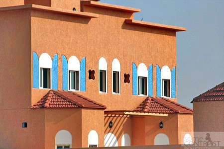
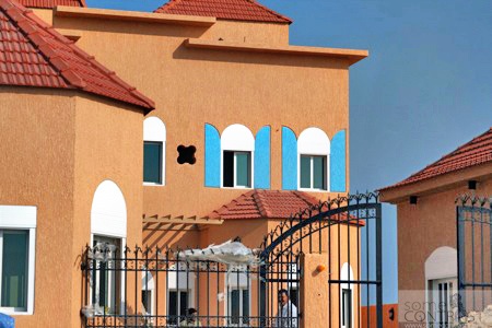
I took these pictures in AlZour area while passing by last weekend. I like what he did with the windows. Sometimes less is more! Simple tweaks like the engraved shutters on this house look nice! and probably costs nothing.
What a difference between the house above and this house HERE. Yikes!


eee shefta lma knt ray7a shaleh 3mty
ana 7sbali bait bs galoly la jdama khoor y3ni 9ar shaleh lol :p
it’s not called alzour anymore
it’s sabah al-ahmad sea city ;p
Love the colors, the engravings. After all, it’s quite true on what they say ” Simplicity is perfection”
don’t you agree
sorry, bs kilish mo 7elow
aaaaaaaah … I second O.K .. 3a6ne ahlag! :p
1st house relaxes your eyes, unlike the 2nd house it pains the eyes & chest !! I still can’t breathe just by looking at it loool
gaFsHa yeah that shalaih was in the new Sabah Al Ahmad area. but AlZour is still called AlZour, it didn’t change.
[He]speaks Agreed. welcome back 😉
O.K. & Q80 in Denver I like that he had an idea and spent as little as possible to make it happen. It’s a shalaih after all
Daddyz Girl lol yeah the second house is mystery.
Ana ham I think kilish moo 7iloo. Maybe if they had toned down the blue? It clashes with the neutral tone of the house, too stark a contrast there. Of course this house is the epitome of beauty next to the second house which is the definition of VISUAL POLLUTION. I say 3oo3 3oo3 o ham ba3ad 3oo3.
its a bit Disney-esque. There’s no simplicity in it at all.
i dont like it either
thats not my taste but its fine better than the hunted house..
That isn’t nice, but isn’t hideous like the one you linked! LOL
There are a lot of ugly houses in Kuwait! LOL
Too many to follow up on!